
How to create Atmospheric Art
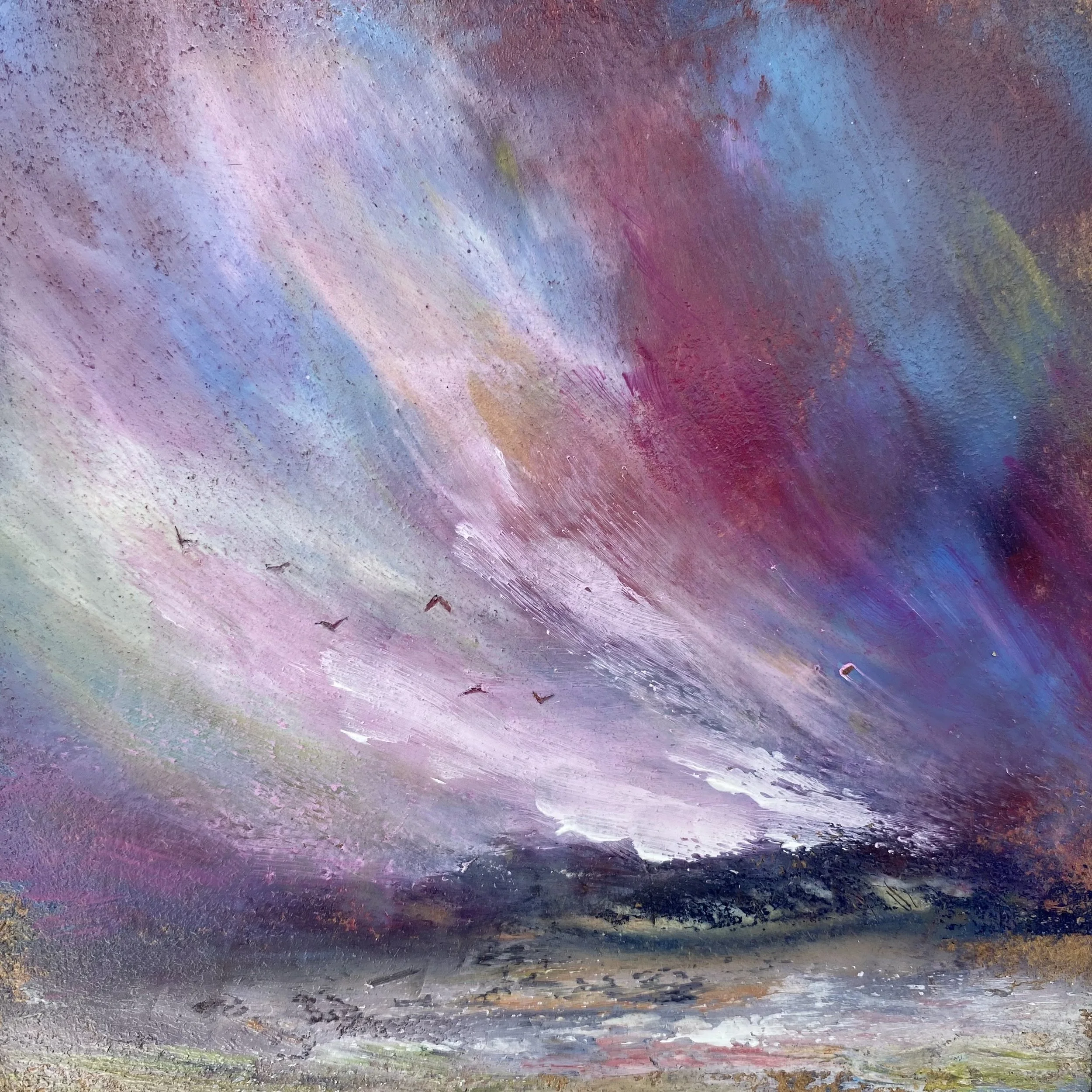
Painting by Cathryn Jeff
Within paintings, elements such as air, light and space can be portrayed in a way that create atmosphere to engage the viewers emotions and connect them to the work. This experience goes beyond simply just looking and admiring an artwork.
We can use colours, paint application techniques and texture to breathe life into a painting to make it more than just a visual representation.
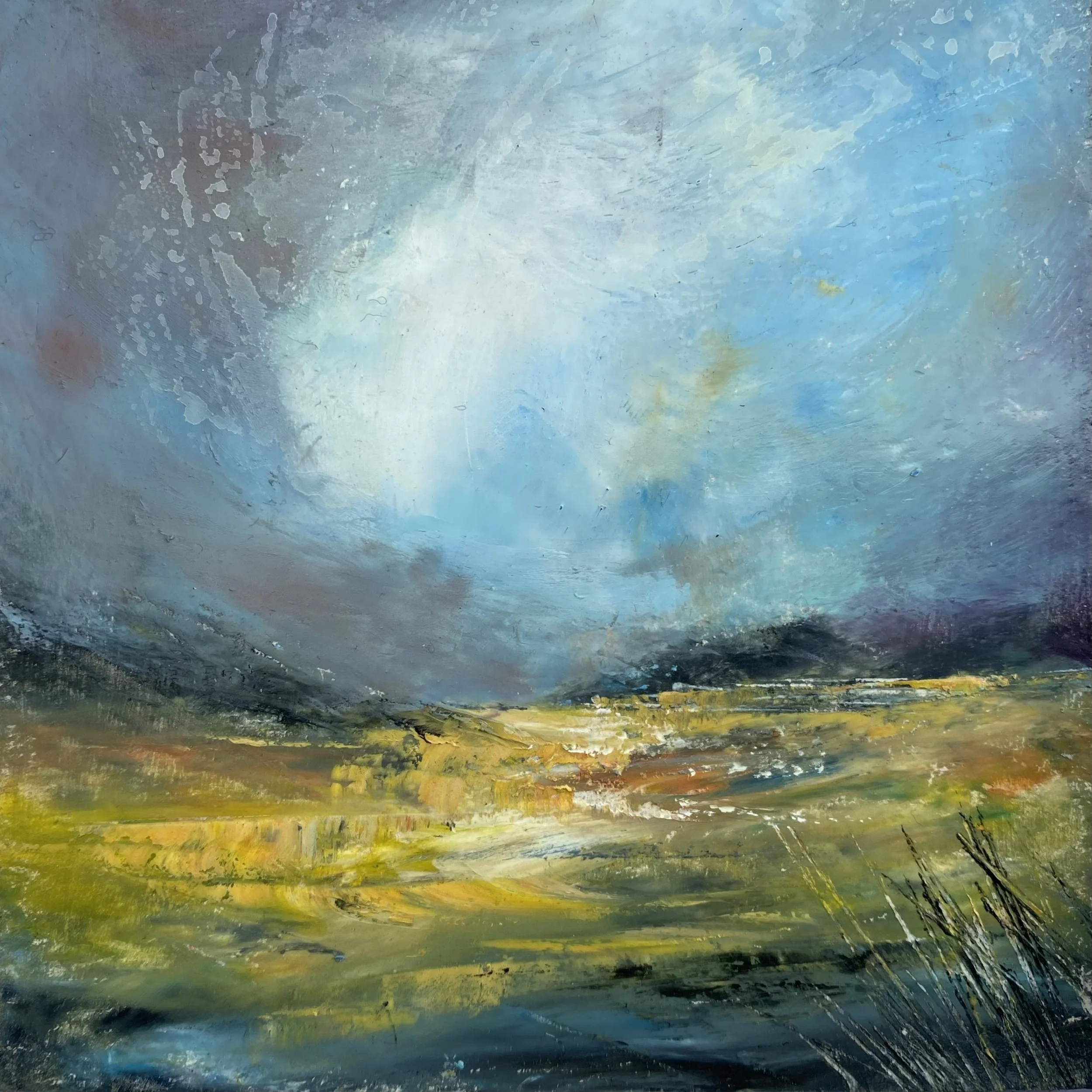
Painting by Cathryn Jeff
Colours
Colours help evoke feeling and mood within a painting, therefore adding an atmospheric element. The predominant use of darker tones in an artwork may convey melancholy and unease. Look at Rembrandt’s works for example. In contrast, brighter, lighter colours create feelings of joy and fun such as Monet’s paintings. Blues and greens give a sense of calm. Reds for passion and anger while orange and yellow convey warmth and happiness.
Light and Dark
A mixture of light and dark tones add balance. For example, a bright sun or moon might benefit from an exaggerated darkened surrounding to increase the sense of atmosphere. Simply darkening any painting towards the edges creates interest and atmosphere too and create focus.
Techniques
The application of the paint can influence the feel of a painting. Use out of focus areas to intrigue the viewer to make up their own minds about what is being depicted, therefore adding atmosphere to the painting. Background areas such as hills, headlands, distant trees, foliage and so on are obvious elements to leave blurred or misty to create a dreamlike scene. Add hard edged, sharp lines to draw attention to other elements, often in the middle-ground and foreground. Creating a mixture of both out of focus and hard lines adds more atmosphere to a piece. Sometimes referred to as ‘lost and found’ areas.
An example of lost and found areas might be a horizon line that could be blurred at the edges of the painting but have a crisp neat edge in the centre to create focus. It is better to simply suggest elements rather than be absolutely literal in their portrayal. If you try to be loose and free with your style these blurred areas will often happen automatically!
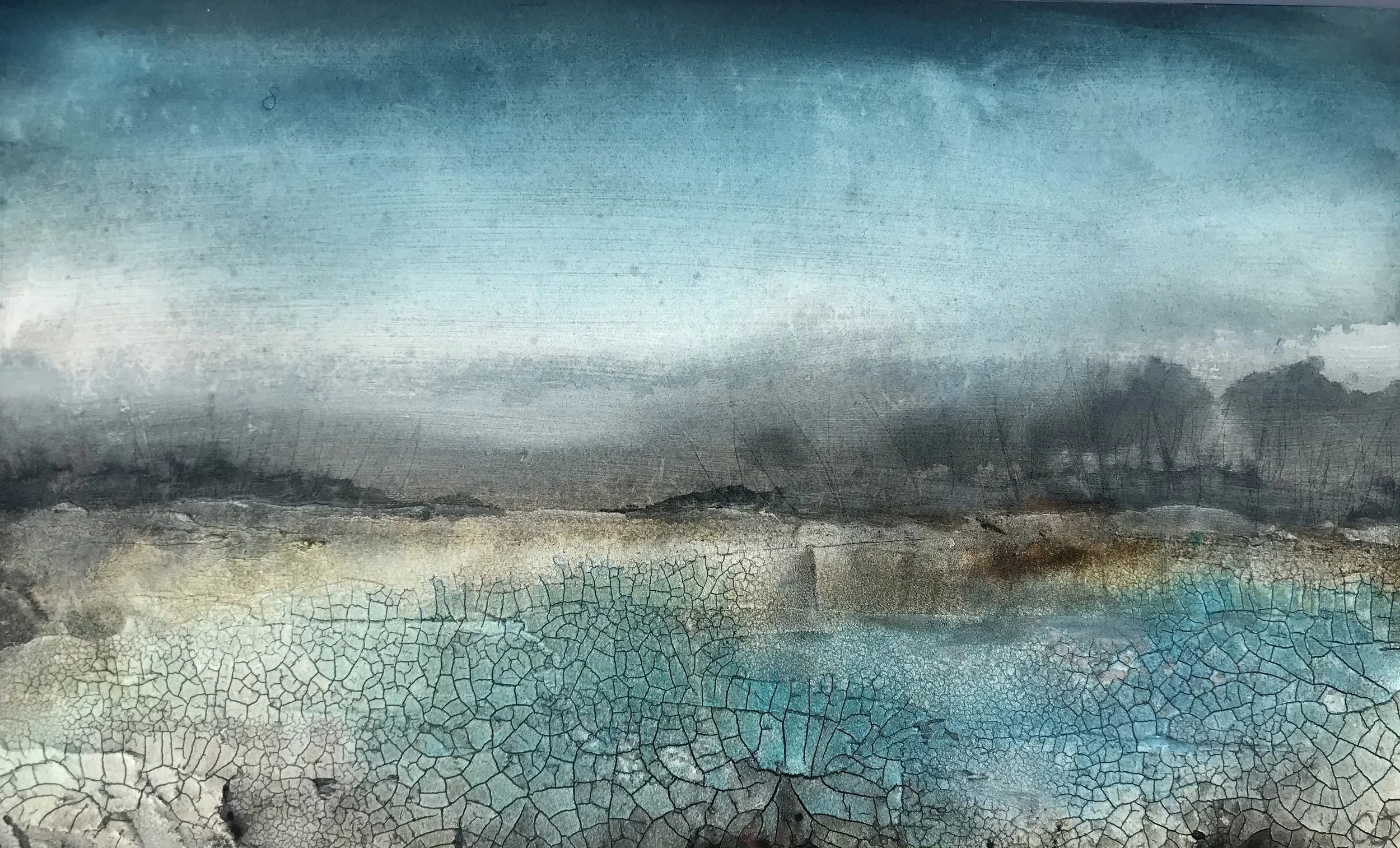
Painting by Cathryn Jeff
Texture
I don’t always use texture in my work, but it can sometimes help stop the painting to look too literal. Adding a simple texture such as sand can be used for an interesting background for blurred areas for example. Heavier textures are better for foreground interest but with a simple composition. Basically, let the texture do all the talking and keep the painting minimal and soft on top.
Paint Application
If you paint too literal and find it hard to simplify a scene, try using an oversized brush, palette knife, spatula, sponge or your fingers to paint with. This will help with suggestive marks and blurred edges as the paint is not applied in a fully controlled manner. Try rubbing wet paint with your finger or a dry brush to soften hard edges here and there. And of course, you can add splattering!
Overall, try to bring your own personality in to your painting. Have a starting point with a reference photo, scene or idea but don’t worry if the paint application or general development of the painting takes you on a different journey. Above all have fun and experiment, you might create some amazing happy accidents!